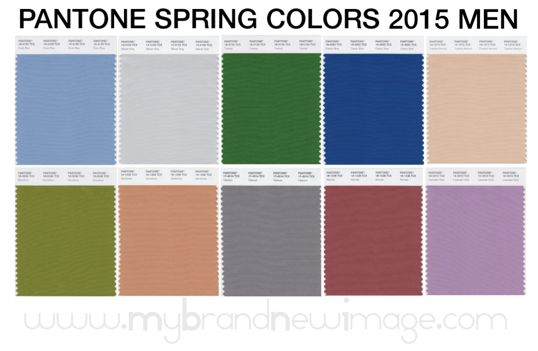
PANTONE® Spring Colors 2015 Men
www.mybrandnewimage.com
The menswear colors emphasize the need for uncontrived hues, where natural tones are interspersed with deep, foundational colors for an unassuming and sophisticated Top 10.
“In a world that has become increasingly chaotic, the nostalgic blues enables us to retreat into a safe place of quiet calm while harmonious greens from nature offer a reassuring presence.”
Leatrice Eiseman, Executive Director, Pantone Color Institute® 1. Dusk Blue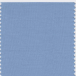
PANTONE 16-4120 Dusk Blue is perennially a favorite shade for men. Reminiscent of the blue sky above, Dusk Blue is ultimately dependable and faithful. In a world that has become increasingly chaotic, the nostalgic Dusk Blue enables us to retreat into a safe place of quiet blue calm.
2. Glacier Gray 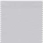
More dominant for men than women in Spring/Summer 2015, PANTONE 14-4102 Glacier Gray is an unobtrusive gray that contrasts and enhances; bouncing off other shades without taking away from them as it slips into the background to allow other colors to take center stage. Nature’s most perfect neutral, Glacier Gray, is a shade that is timeless. Quietly assuring and peacefully relaxing, Glacier Gray is above all, constant.
3. Treetop 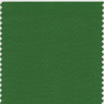
Speaking to restoration and new beginnings, PANTONE 18-0135 Treetop is a natural and fertile green. Ideal when used as a background to other shades, Treetop is a healthy harmonious green from nature, which offers a reassuring presence. Physiologically affecting the nervous system, this soothing green hue causes us to breathe slowly and deeply, helping the heart to relax by slowing the production of stress hormones.
4. Classic Blue 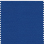
Reliable and thoughtful, PANTONE 19-4052 Classic Blue inspires calm, confidence and harmony. Serving as an anchor to the Spring/Summer 2015 palette, Classic Blue is a shade that is strong and reliable. Just as with the sea, because of its waterborne qualities, this Classic Blue is perceived as thoughtful and introspective.
5. Toasted Almond 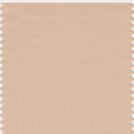
Bringing balance to the coolness of the Spring/Summer 2015 color range is PANTONE 14-1213 Toasted Almond. A sun-tanned neutral, Toasted Almond offers comforting warmth and is indicative of a spontaneous spring, summer feeling. Timeless and versatile, Toasted Almond is an organic shade that speaks to authenticity and all that is natural.
6. Woodbine 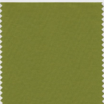
PANTONE 18-0538 Woodbine, is a tropical green that could best be described as nature’s neutral. A classic yellow-green that could be used with anything and everything, Woodbine is a hue of foliage, grass and growing plants. Inexorably linked to our sense of smell, Woodbine is evocative of a freshly mown lawn or a flourishing palm frond.
7. Sandstone 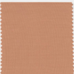
PANTONE 16-1328 Sandstone is a stable and grounded shade. Rugged and woodsy, Sandstone is a complex neutral that has a warming presence. Earthy and real, Sandstone provides us with a return to nature and what is beautiful, simple and memorable.
8. Titanium 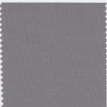
Strong, masculine and solid, PANTONE 17-4014 Titanium is a gray shade that speaks to timelessness. Classic and tasteful, there is an implied quality attached to anything so long lasting. Durable and practical, this basic gray shade has classic appeal.
9. Marsala (Color of the Year 2015)
Interesting on its own and a wonderful contrast for other hues, PANTONE 18-1438 Marsala serves as the foundation to the Spring/Summer 2015 palette. Sensual and bold, delicious Marsala is a daringly inviting tone that nurtures; exuding confidence and stability while feeding the body, mind and soul. Much like the fortified wine that gives Marsala its name, this robust shade incorporates the warmth and richness of a tastefully fulfilling meal while it’s grounding red-brown roots point to a sophisticated, natural earthiness.
10. Lavender Herb 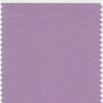
PANTONE 16-3310 Lavender Herb is a shade rich in nostalgia. A unique shade that adds a surprise to the Spring/Summer 2015 palette, Lavender Herb is a shade that intrigues the eye. Lavender Herb is also a creative shade; one that will add a distinctive color pop whether worn on its own or combined with the other top Spring/Summer 2015 colors.
Source: PANTONE® Fashion Color Report Spring 2015

