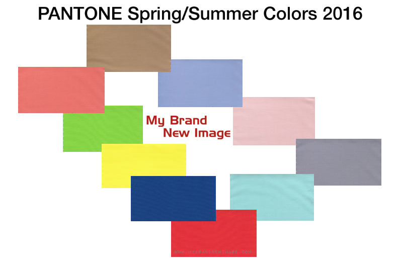
PANTONE Spring/Summer Colors 2016
“Colors this season transport us to a happier, sunnier place where we feel free to express a wittier version of our real selves.”
Leatrice Eiseman, Executive Director, Pantone Color Institute

Influenced by the world of art, new global doors opening and the desire to disconnect from technology and unwind, designers this season have gravitated toward a palette that is first and foremost calming. Paying homage to the beauty of natural resources, colors emerging in the Spring collections serve as vehicles that trans-port wearers to more tranquil, mindful environs, which encourage relaxation first, followed by curiosity and exploration.
Designers were also inspired by the contrast of urban design and lush vegetation, leading to unexpected color combinations and collections reminiscent of architecture, travel and nostalgia. By creating looks that truly represent the world we live in, both constructed and organic, designers sought to awaken a sense of reflection, followed by playful escapism. Artists, many of whom are known for bold color usage and strong shapes and lines, played an influential role in this season’s styles – from Matisse, Picasso and Frank Stella to Esther Stewart and Sam Falls. With Cuba and other destinations south of the border top of mind, designers are playing with courageous color statements that aren’t afraid to be vibrant but at the same time are combined with quieting, classic and more natural tones.
“Colors this season transport us to a happier, sunnier place where we feel free to express a wittier version of our real selves,” said Leatrice Eiseman, executive director of the Pantone Color Institute. “With our culture still surrounded by so much uncertainty, we are continuing to yearn for those softer shades that offer a sense of calm and relaxation.”
PANTONE Color Fashion Report Spring/Summer 2016
